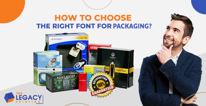
Walking down the aisles of a retail or departmental store can be an overwhelming experience for your consumers. While trying to find the right product, they may feel the shopping experience turning into a game of Where is Waldo? The consumer purchasing decisions never come down to the name of the brand or the product’s price, but the custom packaging in which the product is sold. With the racks being crowded with so many product options, it is best to ensure that your packaging stands out from the crowd.
The Legacy Printing believes that every design element plays its part in attracting consumers. However, the font you choose for your packaging is perhaps the best way to instantly grab attention and communicate your brand message interestingly and creatively. Among other things, typography can help differentiate your brand, define your product and affect consumer preference. Both science and art, typography is an essential component of any packaging design. However, it is not as simple and easy as it sounds. It is not about picking a typeface or font that you think looks good.
In order to choose the right font, The Legacy Printing suggests you consider these points when selecting the font and typeface for your packaging.
Know your audience
Understanding who your consumers or target market is can help you decide on what direction to take. Even before the consumers have processed what they are reading, the font and typeface on a packaging box can convey the idea that you want your audience to receive. For example, the right typeface for custom geared towards Millennials may not be the right typeface for a low-calorie eatable aimed at an older demographic. Therefore, the packaging company suggests you do your research beforehand. Then let your findings guide you when deciding on the proper font.
Packaging size and shape
The product shape and size are factors that can either limit or enable what is possible for your packaging. For example, custom food boxes provide a lot more room for text than a cola can do. Therefore, while designing your customized packaging, arrange the words so that they are prominent and legible, as this will help your consumers find what they are looking for. By having a sense of symmetry and balance in your packaging design, you can create something visually appealing and aid the buyer in making an informed decision.
The packaging company believes that line spacing plays a huge role in the readability of the content on packaging. Packaging boxes contain the product description and the brand logo, usage instruction, barcode, and in the case of food packaging, the nutrition facts. Hence, the line spacing matters when you have to put all this information in minimal space without choking its aesthetic appeal. It will be best if you always tried to maintain a consistent line spacing considering the readability and visual appearance of the packaging.
Typeface and font
The packaging company can help you understand and determine what can look well on your custom boxes, from the kerning between your letters to whether you should use a serif or sans-serif. Your target audience and packaging size can help narrow down your choices. Here are a few points to remember.
Less is always more
Though it may be tempting to write a lot of text or different fonts on your custom boxes, this has the potential to create a cluttered and overwhelmingly confusing design. Using slight and simple variations of the same typeface, you can walk the line between consistency and contrast.
The lower and upper case versus all caps: The human eye recognizes letter characters easier when combining upper and lower cases. This can help your consumers quickly absorb the information that they are reading.
Color considerations: Positive type (light background with dark text) causes the background to expand in the eye and make letters appear smaller. On the other hand, reversed type (white text on a dark background) has the opposite effect and makes letters appear larger. When dealing with smaller packaging boxes, this can be a great way to maximize space.
Counter
It is best to consider the ‘counter’ when deciding on a typeface or font while developing typography for your packaging. The counter is the enclosed or partially closed circular or curved space of the letters. If you consider the letter ‘Q,’ it has a fully enclosed counter, whereas ‘n’ has a partially closed and ‘i’ has an open counter. The counter of the letters must be adjusted thoughtfully as it has a very substantial effect on legibility.
Pairing
Avoid using too many different fonts or typefaces in one packaging. It will reduce the seriousness of the packaging. If we use more than one font in one packaging, then the contrast should be high. The customer must be able to distinguish clearly between the two fonts. The higher the contrast is, the better the readability will be. Thus, pairing is vital in case you choose to use different fonts in one packaging.
Orientation of Stress
Stress is the direction of the width in the curved stroke of a letter. It can either be diagonal or vertical. The easiest way to study the orientation is to analyze the letter ‘O’ in typography.
The orientation of fonts on the custom French fry boxes plays a huge role in conveying the personality of a font. Sans serif fonts, however, tend to have no stress. This is one of the reasons that it is considered to have a very stable, refined, and serious typographical approach. Font stress orientation also has a significant effect on readability.
Hierarchy
The concept of hierarchy in packaging works like magic. Hierarchy is a way to lead the viewer from the essential feature to the least important one. Smart and consistent use of hierarchy will not only make your design beautiful and attract a lot of customers. Still, it will also help you to convert a large number of window shoppers into buyers successfully. Try to highlight the unique features of the product, maintaining a proper hierarchy. Their eyes will get stuck on the shelf when they find their essential features in bold right in front of them.
Whitespace
Whitespace is significant when you are designing packaging. Packaging usually has information that makes it text-heavy in general. Whitespace around the textual parts will give your eyes a breathing space.
The packaging will not look too repulsive. A recent trend suggests whitespace is an essential feature in typography to maintain the ‘Less is More approach. Choose typography that will give you enough scope to maintain fair whitespace in the packaging.
Alignment
Text alignment is essential to enhance legibility. There are four types of alignments: center, left, right, and justified. Use alignment type thoughtfully, wisely, and creatively. Think about the way the customers will perceive it. Use the best style that will make the content readable and the packaging elegant.
The last thing to remind you is our final motto in packaging typography: to make it readable, clean, and aesthetically appealing. So, choosing the font is the most important part of packaging design, as in most cases, the packaging is text-heavy by nature. Complexity fails to amuse people. So, simplicity is the way to go. The clear contrast in font style and hierarchy is an acceptable way to bring clear distinction.
As with many design aspects, there is no cookie-cutter solution to typography for customized packaging. The creative process behind the scenes can take both time and effort. With that being said, it is important to treat typography as a fundamental element of your custom French fry boxes. If done right, it can change the face of your whole brand.
Help keep news FREE for our readers
Supporting your local community newspaper/online news outlet is crucial now more than ever. If you believe in independent journalism, then consider making a valuable contribution by making a one-time or monthly donation. We operate in rural areas where providing unbiased news can be challenging. Read More About Supporting The West Wales Chronicle


