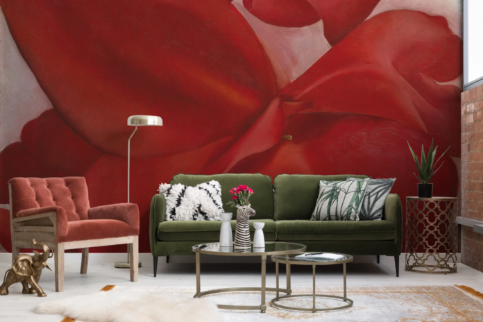
Over the past 30 days, searches* for ‘colour combinations for living room’ (+130%) and ‘bedroom colour design’ (+130%) have significantly increased. While choosing colours to decorate with is an essential part of renovations, how do you know if you’ve made the right decision or not?
Interior wallpaper and murals brand, Hovia has revealed their top design tips for using colour theory to improve the look and mood of the home.
Navigate your style direction with the compass theory
-
North-facing rooms
Rooms that face the north get a constant stream of natural light during the day, but it’s usually a low amount of light. This means the room tends to have a cool tone and might seem dull. To counteract the coolness, use warm colours like red and orange. You could also use whites and neutrals with warm undertones if you prefer a minimal look.
-
South-facing rooms
Typically, they get the most bright light from direct sunlight. This means that the room will often have a warm yellow appearance. Most colours will work nicely with natural light but if you want to balance things out, add in some cool shades like blues, greens, and violets.
-
West-facing rooms
Rooms facing the west get the most sunlight in the afternoon and the evening. That means they can feel grey throughout the day, but then look warm and glowy in the golden hour of the early evenings. If you use this room most in the mornings, warm tones will help balance things out. If you use the room most in the evenings, opt for cooler tones for a bright and fresh look.
-
East-facing rooms
These rooms will get natural light most in the mornings, then gradually get darker during the day. Use fresh, light colours to counteract the dim lighting, such as blues and greens — which act as great transitional colours. Avoid reds and yellows here, since they may be overwhelming in the mornings when they mix with the bright sunlight.
Get familiar with the colour wheel
Most people embarking on their decorating journey will be aware of the concept of clashing and complementing colours. But how do you use a colour wheel practically?
Catherine Jacob, Head of Design at Hovia explains everything you need to know about using a colour wheel when planning your interior colour palette:
“Colours that sit opposite each other are complementary colours, which means they pair well together (our eyes like seeing them together!). Colours adjacent to each other on the wheel are analogous colours. Interior designers often like taking a colour and supporting it with the two colours either side of it on the wheel to create an eye-pleasing colour palette for a room.
-
Monochromatic colours are different shades and tints of the same colour.
-
A colour in its original form is called a hue.
-
If you add white to a hue to brighten it, that’s called a tint.
-
If you add black to the hue to darken it, that’s called a shade.
Remember: Neutral colours contain undertones, so when you pair them with a stronger hue, you’ll want to choose a neutral colour with a complementary undertone. For example, a blue hue will work well with a white tone that has a hint of warmth in its undertone, such as ivory (which has a yellow tint) or navajo white (which has an orange tint).”
For more design inspiration visit: https://hovia.com/uk/inspiration

| [donate]
| Help keep news FREE for our readersSupporting your local community newspaper/online news outlet is crucial now more than ever. If you believe in independent journalism,then consider making a valuable contribution by making a one-time or monthly donation. We operate in rural areas where providing unbiased news can be challenging. |


